Why I Trust Psychology Over “Common Sense” in Web Design
Web design is often mistaken as a “common sense” practice, especially when smack dab in the middle of a marketing agency. It becomes a “too many cooks in the kitchen”, overly assumed task, muddled with ideas generated by what many would say is logical. However, we find that many high performing sites can attribute their success to pattern recognition, sensory adaptation, and adhering to expectations.
In this blog post, I will break down some critical, psychological practices that have been proven to work in web design.
Color Recognition And Acceptance
Everyone reacts to colors differently. There’s no “accepted” way to use them, however trends have shown us that gender plays a huge role in how we perceive them.
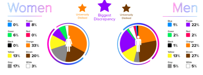
Web Design Depot published a graph showing the differences between men and women’s reactions to colors, specifically ones they like or dislike.

While there are many similarities, there’s also some stand out trends in both the dislikes and likes. For example, in this study, a quarter of men dislike the color purple, while a quarter of women like the color purple. Seems rudimentary, but this stat can save you quite a bit of time in design.
On your next project, consider working gender into your audience analysis. Oh, and refrain from using brown at all costs.
Pattern Recognition
What do people follow more than anything else? Their past. People are comfortable with things they know, things they’ve felt, the easiest path to be quite blunt.
This phenomena can be attributed to Weber’s Law of Just Noticeable Difference, which explains that small changes to something don’t influence a noticeable difference in the observer’s point of view.
How does this apply to doing web design? Does it apply? OF COURSE. Why do you think Reddit looks the way it does? Because it worked the first time. Don’t reinvent the wheel with a redesign. Take what works, tweak it, and deploy. Often times businesses hire on a web design firm and it turns into a massacre of the original.
You may say here, “Then why do a redesign at all?!” Look, if your site isn’t performing at all, has no visitors, and struggles to even load, then do a full overhaul. If you’re a public enterprise, roll your changes out slowly and surely, that way the majority of users won’t even notice you’re making changes. Remember, people like to stay in their comfort zones.
Forget Trends, Try Dumbing It Down
You may like a new font… You may see a cool, new layout on AWWWARDS. But I urge you to do one thing when designing: DUMB. IT. DOWN.
An ex-coworker of mine advised me to use his method, which he dubbed “Drunk Driving”. No, this is not advising to operate your vehicle inebriated. The method had one purpose: make your design navigable to someone completely drunk. If you do that, then everyone will understand how to navigate what you design.
Sure, new styles, trends, and evolutionary works are what keeps the internet interesting. But that isn’t for those who need immediate sales or a boost in readership. By making your site simple, you allow for the end user to walk your path easily and often times, joyfully.


