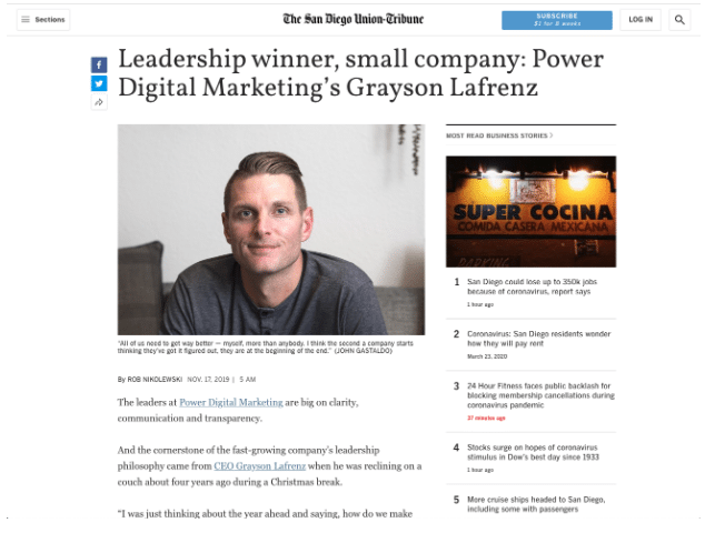
Power Digital Announces Creative Affinity.

Learn More Here
Blog Post

What Is Responsive Design?

April 25, 2018
Table of Contents

In this day in age, I seem to check most websites on my phone. However, nothing upsets me more than encountering a site on my phone that doesn’t look aesthetically pleasing and is almost impossible to navigate within. This is an issue that you may encounter with an un-optimized website, but thankfully most sites have turned to Responsive Designs.

What is Responsive Design?

Responsive design refers to a new approach that is heavily used on web design & development. This approach consists of making your site responsive to any sized screen that is used, such as iPhones, iPads, computers, etc. This makes navigation much easier and gives the user great UX (User Experience).

Why Is It Important?

The reason that this approach is required by many is due to the different viewports that are in play when launching a website to an audience. Even though computers are still heavily used to navigate through the web, mobile devices play a large part of the traffic depending on the industry. So, it is imperative to have a site optimized for all devices that would be used so you don’t lose traffic.

SEO is a key reason to have a responsive site as well. If a site is not optimized for mobile use, it will affect its rankings. This is because a mobile website should act faster and be lighter than a desktop site, and if not, Google will punish them by lowering their rankings.

How to Make Your Site Responsive

There are different ways to make your site responsive, but the most common ones are through media queries and frameworks.

My favorite framework is Bootstrap. This framework makes the process of creating a responsive site way easier and faster due to its incorporated grid that allows you to layout your site within rows and columns and decide when to display, stack on each other, etc. Bootstrap is very well developed and it’s continuously being updated and adapted to new technologies and browsers updates. So, I highly recommend using this to develop your site.

On the other hand, if you want to customize sections on your own you will need to explore Media Queries.

The Media Queries are the best way to adapt your site to any size imaginable. It is highly customizable, but it requires more time to implement correctly.

Media queries are implemented through CSS3 and its most common syntax looks like this: @media screen and (max-width: 768px){…}

You can insert any CSS within those brackets which would be applied to screens that follow those specific properties. In this case, any screen and viewports with a width no more than 768 pixels.

You can use as many properties as you want to specify your desired selections, but the dimensions that I normally use and recommend using are these:

  1. 320px
  2. 480px
  3. 768px
  4. 992px
  5. 1200px

Best Practices

By knowing these tools, your site will be more responsive and become more usable. Some other common practices are:

  1. Whenever your navigation doesn’t fit on your screen width, make it an expandable hamburger which will contain all the navigation without affecting the layout of the site.
  2. Hide or stack the sidebars below the content.
  3. Decrease fonts for certain sizes.
  4. Set your images to use a Max-width of 100%.

These common practices will make your site look great and give an excellent UX to your audience. This will not only make your users happier, but it will also increase your rankings in Search Engines!

Empowering you to break the mold.

Kind of like a full-service agency, kind of like an in-house CMO. Elevate your brand's presence with custom strategy, channel expertise, and flawless execution.

Learn More