How to Use Yoast SEO WordPress Plugin

Yoast SEO WordPress Plugin is an entirely free yet extremely powerful SEO tool that readily enables “all-in-one SEO” for websites built via WordPress (also known as WP for short).
The Yoast SEO Plugin has gained strong popularity for a variety of reasons, including its proven stability and wide range of features, and is now used on millions of sites all across the internet.
In fact, Yoast boasts that their SEO WordPress Plugin is the world’s “No. 1 WordPress SEO Plugin” – and highlights its array of benefits that include attracting more visitors from not only Google and Bing search engines, but from social media channels as well. Yoast also advertises “increased reader engagement” as a compelling benefit of its SEO WordPress Plugin, which it claims has been downloaded more than 40 million times.
Here, we’ll show you how to use Yoast SEO Plugin to empower and boost your own site. We hope this Yoast SEO tutorial provides you with a better and deeper understanding of this powerful WP plugin.
Related: Technical SEO Checklist & Guide – Tips to Make SEO Easy
How to Set Up Yoast SEO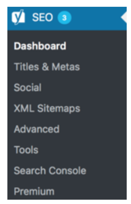
Successful Yoast SEO WordPress Plugin setup and usage starts with a strong understanding and working knowledge of the dashboard panel. Knowing how to navigate Yoast on your WordPress website is key to any strong SEO strategy.
You can find the Yoast SEO configuration wizard at “SEO > Dashboard” in the Yoast SEO settings – and within that configuration wizard, you will be guided through 12 steps that help you configure the Yoast SEO WordPress Plugin, specifically for your site.
Each step includes some specific questions, and your answers to these questions will determine specific Yoast SEO settings. In the configuration wizard, you’ll also find videos that detail and demonstrate additional options.
The SEO dashboard panel on the Yoast WP plugin lists seven different subcategories or “tabs” – Titles & Metas, Social, XML Sitemap, Advanced, Tools, Search Console, and Yoast Premium.
Let’s take a closer look at each of those tabs and learn how to use Yoast SEO Plugin right now.
Related: WordPress SEO Tips & Tricks
SEO Title Tags & Metas
Titles & Metas allows you to modify and add titles and meta descriptions for posts, pages, and archive pages so you can use the focus keyphrase you want to rank for. This way, you can make sure your page really stands out within the search results. Here, you can also easily set templates for titles and meta descriptions for all types of pages – from homepages to categories to archives, posts, and more.
With Yoast SEO, you even get a snippet editor that provides previews of how everything looks in Google and allows you to implement your focus keyphrase to your title tag and meta description. If you enter a “focus keyword,” it will stand out in the search result preview – exactly the way it will in the search results.
The snippet editor can be found in the Yoast SEO meta box, located under the main content block of your post or page. Simply click on “Edit snippet,” within your WordPress dashboard and the snippet editor opens, allowing you to amend the title tag, slug, and meta description.
Social
The Yoast SEO Plugin not only addresses your SEO performance within Google and other search engines but helps you optimize and achieve enhanced results via social media channels as well. The Social tab houses these options, with Facebook and Twitter the primary social media channels addressed – but Google+ and Pinterest also accessible.
Much of the Facebook optimization occurs via the usage of OpenGraph. Within the Yoast SEO Plugin, go to the “Facebook” tab under “Social,” and make sure OpenGraph is enabled. From there, you’ll need to decide whether your site admin is an application or an actual person, such as yourself or a co-worker. Click the appropriate button and follow the on-screen prompts to Facebook.com. Once there, enter the Facebook Page URL for your site or brand on the “Accounts” tab, thereby connecting to each post as the content publisher.
You’ll need to decide on other settings, such as what image to use for the Frontpage, as well as a default image. Then you’ll go to your personal WordPress profile and add a link to your Facebook profile, and enable the “Follow” functionality on Facebook.
The Twitter functionality, known as Twitter Cards, is not drastically different from Facebook’s OpenGraph. Similarly, you’ll need to select an image, a description, the Twitter account of your site or publisher, the “name” for the domain to be displayed in a Twitter card, and the Twitter account of the author. You can fill out information under the “Twitter” tab within “Social” and you should enter information about the author’s Twitter account on your individual WordPress profile page.
XML Sitemap
Another great feature of the Yoast SEO Plugin is known as XML Sitemap. Yoast generates this sitemap for the consumption of search engines like Google and Bing. XML Sitemaps contain all important pages of a site to help the search engines determine its structure. Remember, you want Google and the other search engines to crawl every important page of your site – and to easily know when you’ve last updated those pages. Having your site indexed by search engines is a primary and crucial step in the SEO process. By creating a strong sitemap, you greatly improve the odds of your site being fully and properly indexed.
If you want the search engines to find your XML sitemap fast, you’ll need to add it to your Google Search Console account. You can find the sitemaps in Search Console by clicking on “Sitemaps” within “Crawl” – you’ll immediately see if your XML sitemap is already added to Search Console. If you don’t see it there, click on the “Add/Test Sitemap” button.
The Yoast SEO Plugin automatically creates a XML sitemap for your site. You can view it by clicking on “SEO” and then selecting the “Features” tab in the sidebar of your WordPress install. Here, you can enable or disable the XML sitemap for your site. You can also exclude content types from your XML sitemap via the “Search Appearance” tab.
Advanced
The Advanced tab in the Yoast SEO Plugin panel allows you to configure the “advanced” SEO settings that will be used for a specific page or particular post. Here, you can configure breadcrumbs, permalinks, and RSS feed-related settings. Breadcrumbs can help assist in internal linking and provide an added boost to your site in the search engine rankings.
Breadcrumbs are great for internal linking because it defines a clear path or trail to the page you are on. These breadcrumbs also appear in search results giving your site extra advantage in the search. If you choose to add a backlink to your own site for each post in your RSS feed, you will get backlinks from any “content scraper” copycats out there – and Google will know that you’re the original source of this copied content.
Tools
The Yoast SEO Plugin comes with some very powerful tools, easily accessed via the Tools tab on the SEO dashboard panel – Bulk Editor, File Editor, and Import and Export. Bulk Editor allows you to quickly change titles and descriptions of your posts and pages, while File Editor enables you to make quick changes to important SEO files like robots.txt. The Import and Export tool can be used to import settings from other SEO plugins or export your settings for use elsewhere.
Like the Advanced tab, the Tools tab isn’t really required for usage by beginning or intermediate-level SEO practitioners. Remember, the Yoast SEO Plugin was carefully and thoughtfully developed by high-level SEO experts. Default settings alone are often enough in many areas of this powerful WP plugin.
Search Console
There’s much more you can do with Yoast SEO. In the Search Appearance menu, you can establish how your site will appear in search engines. In the Search Console section, you can also connect your Google Search Console account to Yoast SEO, enabling it to find and fix any errors.
The Search Console settings can be found further down the SEO menu. If you completed the Yoast configuration wizard, you likely connected Google Search Console to the Yoast plugin. If you have not done that, you can do it at any time using the Search Console section.
Just go to “Search Console” under “SEO,” and click the “Get Google Authorization Code” button. This will take you to Google Search Console, and once there, you’ll be asked to confirm that you want to connect Google Search Console to the Yoast SEO Plugin. Simply click “allow” to enable this connection. You’ll then receive a “key” to copy and paste into a box in the Yoast SEO Plugin, where you’ll then click “Authenticate.”
If you connect Google Search Console to the Yoast SEO Plugin, you’ll have an excellent overview of just how many crawl errors Google finds on your site. You can then create redirects for these 404s or change them to 410s if that page is no longer of use to you.
Yoast SEO Premium
Yoast also offers its SEO Premium – a paid (at the rate $89 for one site), upgraded option of the Yoast SEO plugin that includes one year of free updates and full support from the professionals at Yoast. Yoast SEO Premium also features video tutorials that better help you understand each of the plugin’s features, a redirect manager that allows you to quickly set up redirects, and much more.
The redirect manager empowers you to easily redirect a URL if you make changes to it. Whether you’re overhauling your site structure or simply cleaning up pages on your site, you run the risk of visitors coming to a “dead end” that reads “404 not found” when they visit a deleted, old URL. The redirect manager in Yoast SEO Premium gives you many options after you delete a post or page, or change a URL. You can easily redirect to another URL, make it serve a 410 Content Deleted header, a 451 Content Unavailable for Legal Reasons header, or other available options. Simply select your preferred choice from the available options.
There’s also an internal linking feature that comes with Yoast SEO Premium. Here, you’ll find options for posts that you can link to from your current post. Based on what you’re writing and posting about, this internal linking feature (via the Insights tool in Yoast SEO) will collect prominent words in your post, then alert you to related posts that you can choose to link to. This helpful feature is designed to drastically increase how many internal links you have in your site – leading to more, deeper, and longer reader engagement on your site, better SEO rankings for your site, and more.
Related: Internal Linking Best Practices
Our Editorial Standards
Reviewed for Accuracy
Every piece is fact-checked for precision.
Up-to-Date Research
We reflect the latest trends and insights.
Credible References
Backed by trusted industry sources.
Actionable & Insight-Driven
Strategic takeaways for real results.


