Empathy: The Key to Great Design

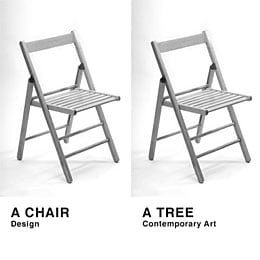
Whenever I tell people that I work as a web designer, most people assume that my work solely has to do with the decorative aspects of creating a website. People, including designers, sometimes mistake design as being art. Now, this can be debated for hours and take up the entirety of this blog post, but for now I’ll give you my stance on the two.
For me, the difference between art and design lies in their specific purpose. Art is personal—it’s reflective of the artist and their feelings, it’s intended to inspire, but doesn’t necessarily have an end goal. Design on the other hand is message-driven —it’s meant to communicate, whether it is to get someone to buy/use something, go somewhere, or grow their knowledge base.
Although the end goal for web designers is to make a website, landing page, or even an email as visually pleasing as possible, the additional responsibility of a designer is to take into account the functionality of what they create. Our duties don’t just stop at making something “look pretty” – they also encompass how our designs connect with the user.

Understanding the balance between aesthetic appeal and functionality for users is pivotal when designing, and the best way to bridge that gap is through empathy. Here’s why empathy is essential to great design:
Empathy Isn’t Best For Just The User, It’s Best For Your Client Too
For web designers, empathy begins at the discovery stage of a project. We need to first understand who the company is, what they do, how they do what they do, and why they do it all in the first place.
Related: Why I Trust Psychology Over “Common Sense” in Web Design
Learning the “why” is where empathy comes into fruition. This is because the “why” of a website is twofold: 1) it’s representative of the company’s purpose, messaging, and vision, and 2) it’s what drives users to the site. Understanding why the website exists and why people go there allows designers to better envision and communicate their website design.
Empathy Allows Designers To Dumb Things Down
Designers must keep their perspectives in check when designing websites and maintain an “anyone can do it” approach. Although it depends on what kind of site or webpage you’re building, as well as your client’s vision, the simple approach to design is usually the best route to take.
Take the internet’s adoption of the hamburger menu in recent years. Albeit controversial, now in 2017 the hamburger menu has become so widely adopted, especially in the age of mobile devices, that we tend to expect it in our apps and websites nowadays. This is because the hamburger menu has proven to be simple and effective.
User Behavior Is The Foundation For Empathy In Design
How users interact with a website is the most important aspect to consider when designing for the web. An example of this would be people’s natural instinct to gravitate to what’s familiar to them. Referring back to the hamburger menu: its adoption as a “best practice” for mobile design has become so engrained in users’ behavior with mobile devices that it’s now expected when navigating through a responsive website.
Related: Responsive Desing vs. App Development: Weighing the Options
Users also have an inclination for hierarchy—they become attracted to dominant elements of a webpage, which can be achieved through scale or color. A good example of this would be the hero section on a homepage. Typically, hero sections are the biggest sections on the page, containing big and bold headings in order to catch the users’ attention, and ultimately, drive conversions.

This is where CRO comes into play as well, and tools like VWO can help designers actually see how users interact with a website to see what sections of a site people are gravitating towards and which sections they are ignoring completely.
Closing Thoughts
Empathy can be an essential resource for balancing the beauty and function of a website. The key to empathic design for the web, however, involves knowing the who, what, how, and why users do what they do.
Our Editorial Standards
Reviewed for Accuracy
Every piece is fact-checked for precision.
Up-to-Date Research
We reflect the latest trends and insights.
Credible References
Backed by trusted industry sources.
Actionable & Insight-Driven
Strategic takeaways for real results.


