Designing Online Quizzes that Convert

The advantages of online interactive quizzes are endless: you can find out what your favorite color says about your personality, if your significant other truly is “the one,” and test your knowledge on (surprisingly difficult) John Stamos trivia.
But, in all seriousness, the benefits of online quizzes to marketers truly are endless. By helping us drive more traffic to our sites, engage with qualified leads, and gather valuable insights, quizzes aren’t a bad tool to have in your marketing toolkit. At Power Digital, we use a platform called Boombox to create online quizzes that, when paired with an innovative paid social strategy, bring our clients unparalleled results.
However, before we can begin the segmentation and retargeting process on Facebook and start seeing dollar signs, we first have to create the actual quiz for searchers to click on. And, believe it or not, a lot more strategizing goes into the interactive quiz creation process than you might think.
From coming up with the topic to researching questions and outcomes, creating a quiz is a lengthy process (at least creating a quiz that converts). However, one of the most important steps in the process is the design phase. After all, you don’t want all those hours spent on strategy, research, and writing to go to waste by not putting the same amount of effort into the design process.
Be sure to create a quiz that converts and looks great by following these helpful tips:
Use A Background Image
One of my favorite things about Boombox is the tremendous amount of customization it allows. You can make quiz questions as heartfelt, funny, or branded as you’d like using images and text strategically.
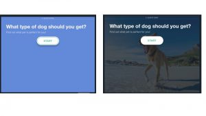
One of the first things I do when I start working on a quiz is change the main background image. When you first start building your quiz out in Boombox’s software, the default background image is a solid color, and, personally, is not my cup of tea.
The background image (along with the title) is the first thing that a test taker sees when they encounter the quiz online. And, being the people pleaser I am, I always make sure that any quiz I make has a great first impression on people, which means that I always opt for a compelling image rather than a solid color. Just look at the example below… which one catches your eye?

….That’s what I thought.
Avoid Corny Stock Imagery
I cannot repeat this enough. Nobody likes being bombarded with staged stock photos. I’m still wondering how people still get paid to participate in them! But that’s beside the point. Although you know that your quiz is essentially a first sales pitch for your business, the people taking the quiz don’t always know that.
As a result, it is important that the quiz remain mostly unbranded until you make the offer at the very end. Otherwise, the user may become suspicious that you don’t have their best interests at heart and quit midway through. And although corny stock images aren’t necessarily “branded,” they are super salesy. So, do yourself (and your quiz takers) a favor and leave the cheesy stock photos at the door.
Use A Mix Of Imagery, Gifs, And Illustrations For Answer Choices
When designing your quiz, it is important that you keep your end goal in mind at all times. And after conversions, the second most important KPI is engagement. In other words, you want people to finish the quiz once they’ve started (or else there is no chance that they’ll see your offer at the end).
For this reason, I recommend using a mixture of compelling imagery, funny gifs, and engaging illustrations. Some of my favorite sites to use to find these creative assets are Giphy, Pexels, and Pixabay. Here you’ll find royalty-free images and gifs for free! Or, you could always get in touch with your creative side and design them in Photoshop or Illustrator.
Use Styled Text When There Isn’t Specific Imagery Available
Sometimes, a picture isn’t worth a thousand words, and it makes more sense to convey your ideas in words rather than images. But don’t worry, just because you are typing something out doesn’t mean that the answer choices on your quiz have to look dull. Using tools like Canva and Photoshop, you can style out your text to make your written answer choices as compelling as any image.
Make The Outcome Descriptions & Images Fun And Engaging
The outcome is the most important part the quiz creator’s idea. This is the whole reason why people take your quiz in the first place – to discover some hidden truth about themselves. As a result, you want to make sure that each outcome description is positive and reflective of their responses. Make sure that you use a lot of “you” statements in the descriptions to make the user feel special and valued.
Making the user feel good about themselves is a critical element in the quiz design process. The description is placed right above or below your offer, and if someone is unsatisfied with their outcome, they will be less likely to respond positively to your offer and, subsequently, your brand.
Other than focusing on making each outcome description as unique and positive as possible, it is also important that you choose a compelling image to accompany it. If people share your quiz through their social media channels upon completion, the outcome image will be the one displayed in their social post. Choose wisely!
Our Editorial Standards
Reviewed for Accuracy
Every piece is fact-checked for precision.
Up-to-Date Research
We reflect the latest trends and insights.
Credible References
Backed by trusted industry sources.
Actionable & Insight-Driven
Strategic takeaways for real results.


