The New Adwords Experience: The Good, The Bad, the Ugly
If it ain’t broke, don’t fix it. That is the age-old adage that Google generally disregarded in an effort to create what they are dubbing “The New Adwords Experience.” In any Adwords account, you can now click over into the New Adwords UI and test pilot a new way of managing bids, ads, budgets, keywords and everything else that took you month’s (maybe years) to master. On top of that, Google has set an undisclosed date to sunset the old user interface. If it feels like you’ve been accustomed to driving an automatic car and now all of a sudden are forced to drive a stick shift, don’t worry, you’re not alone.
OK, I’m being a little overdramatic here. But I think Adwords users are, in general, pretty upset with the change in scenery (and use-ability). I can certainly sympathize with their plight. Adwords has been a tool that I’ve used almost every day for the last six years. That being said, the new UI is kind of growing on me. There are a few features that have been included that I like and somehow the overall look and feel of the interface seems much more 2018. There’s more data visualization, which I’m a sucker for and adding filters/segments feels a little more fluid after you get used to it.
So before we start panicking about the UI change too much, let’s take a quick second to analyze and assess some of the good things the new UI offers, some of the bad, and the downright ugly.
The Good
I mentioned before that their new UI is much more fluid and it really is. Adding columns and/or segments within the campaigns or keywords tab is actually pretty quick n’ easy. I like that you can click into the column headers and type in what metric or segment you want to add to the table. Much better in my opinion than what the previous interface had to offer.
I also mentioned more data visualization, and there is an abundance of this in the new Adwords user interface. Nearly every single tab has some available graph to help visualize the data. A new feature where this is especially noticeable is within the ‘Demographics’ tab. If you ever ran GDN ads in the old UI, I’m sure you may have been frustrated by the lack of continuity in setting up targeting and/or exclusions. Well, that’s been addressed in the new UI structure and also (hold for dramatic effect) those targeting criteria such as parental status, age/gender have been rolled out as targets for search. What’s great about this too is that you can toggle between bid only/target & bid at the ad group or campaign level (more on target & bid later).
Editor’s note: Applying bid adjustments to demographics was available in the old UI, but it was a very low impact, as the data aggregation didn’t seem to collect accurately. Household income targeting was also a thing in the old UI but was housed under location targeting.
Another cool addition to the UI is promotion extensions. These extensions were sometimes available in the old UI depending on the season (Black Friday, Labor Day etc.) but it was not reliable. They will now be available all the time for use with promotions and deals. Do note that these promotion extensions will supersede any structured snippet extension you may have set up.
Related: 5 Adwords Columns All Advertisers Should Use

The Reporting feature is arguably my favorite overhaul in the new interface, mainly because it is so customizable. As with the column builder you can now easily click and type in what you want to slice your data with and it will comply. On top of data tables, we can now also build pie charts, line graphs, bar charts, and scatter charts within this report (again, I’m a sucker for data visualization). This has added a fresh new wrinkle in several of our client-facing reports that allow us to depict things like desktop performance vs. mobile performance in an easy to digest manner and in many different ways (in case we need to drill a point home). You can also now construct heat maps when analyzing time of day metrics (!).
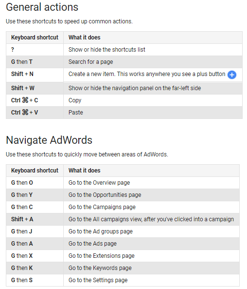
For all you power excel users out there, Google has also added keyboard shortcuts. This is extremely useful for quickly navigating around the interface and acts in a very similar manner to excel. To bring up the menu for shortcuts, hold Shift then press N, then release both keys while in the interface. From there, the shortcuts are below:
There has also been the inclusion of Show Case shopping ads! This is a new ad type for product listing ads that we’re all pretty excited to start using. When you create a new shopping campaign, you’ll be able to see a new ad group type when going through the setup process in the new UI.
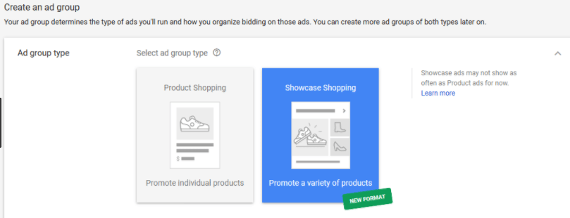
Instead of showing just one item, show case ads will show multiple items within your product feed.
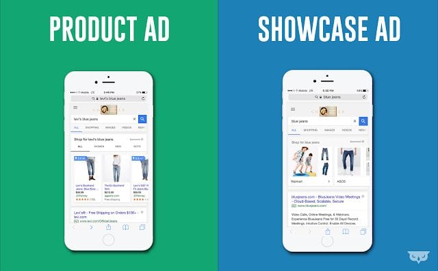
Do note that these new ad formats DO NOT contain prices prior to a click. This could affect conversion rates on site, but could also boost CTR’s. After doing some planning for a rollout with several clients and also after consulting our Google reps directly, we recommend duplicating PLA campaigns with the first set geared towards standard product listing ads, and the second opted for showcase ads. The reason being is so you can more tightly control ad spend/daily budget and also bidding. There is a chance that the showcase ads prove themselves to be higher funnel and in that event, you’ll want to spend budget accordingly. Also, as with any PLA campaign, make sure to hound those search query reports and liberally apply negative keywords to ensure quality ad serving.
Also, kind of a small alteration but I appreciate what they did with the ‘Change History’. It’s now super easy to see not only what changes were made, but at a glance how many changes were made to an account. If you’re ever in a position where you’re auditing an account, this could be a great tool to capture some business.
The last feature I’ll add here is that I find the Overview section pretty helpful. This is a great stop for one-off insights that are actually actionable. It’s very reminiscent of the ‘Home’ section in the old UI but much more easily digestible and with one-click changes available.
Related: AdWords Search Campaign Structure Best Practices
As I stated earlier, I was very apprehensive about the new Adwords experience, but after sticking to using it for several weeks now, there are definitely areas from the old version that were improved upon.
The Bad
Now that we’ve talked about the good things that have come about with this overhaul, let’s discuss some of the negatives.
First and foremost, nearly everyone I’ve spoken to that’s been accustomed to the old UI has expressed a lack of enthusiasm for the change in paradigm. I was certainly one of those people. There was seemingly no real need to depart from the old way of how things were done. I still find myself reverting to the old UI for some tasks just because I know that interface like the back of my hand. I meticulously mapped out every nuance and crevice within the program (as I’m sure many of you have) and to have the entire layout change overnight was jarring, to say the least. So before we even get into some of the things I don’t like about the new UI, it’s worth mentioning that we may all have a slight bias against the latest version of Adwords regardless of functionality (I’ll let you be the judge).
Also, toggling between pages is no longer a thing. In the old UI, if you were in a specific campaign and wanted to look at keywords in an ad group individually and quickly, you could press on the ‘Next’ button and look at the next set of keywords in the next ad group. In the new UI, this isn’t possible. Instead, we’ll have to click back into the campaign and look for the next ad group to investigate. This can be wildly inefficient and frustrating.
One thing we also noticed is that when we segment by conversion name/action, we actually don’t get a totals row at the bottom of the table. So that can make it pretty tough to quickly get a sense for which network is accounting for which conversions. There are some obvious workarounds, but it turns a quick glance into a little bit of a process.
The big one that our team is having a hard time coming to grips with is the complete dismantling of the keyword planners’ functionality. You can now only get additional ideas based off three keywords AND you can no longer use negative keywords (keyword exclusions). This makes the process a bit cumbersome. You can download the data and filter with excel, but if we’re trying to get granular with our targeting, this can be a huge pain.
Also, we can no longer add campaigns to negative keyword library from the negative keyword libraries page (which seems awfully counter-intuitive). Instead, there is now a pretty convoluted workaround where you highlight campaigns in the campaigns tab, then click edit, then targeting, then negative keyword lists. I took me literally three weeks of using the new UI every day to finally figure this out (*places dunce hat onto head).
The Ugly
Well, no one likes change initially, so anything that Google threw out was bound to be met with criticism. That being said, they could’ve made the interface a little more negotiable and ‘familiar’. When you first log in, the whole experience feels somewhat foreign. It doesn’t feel like the old UI, it doesn’t feel like Adwords editor, and it is vaguely reminiscent of DoubleClick’s user interface, but that’s not something every Adwords manager is typically using.
It also seems like Google added things just for the sake of adding them in the new interface. One thing I’d like to directly call out here is the Advanced bid adjustment feature. In my opinion, this is wildly unnecessary and only acts as a way to make Google incrementally more money. The function is supposed to allow you to bid upon call extensions when your ad appears on a mobile device. In the old UI, all you had to do is set up a call extension and you were almost guaranteed to have your click-able number appear in conjunction with your ad. Now in order for it to show with a high confidence, you have to bid up on the extension, thus increasing the cost per click. Thanks Google.
Related: 11 Settings You Need to Check Before Posting a New AdWords Campaign
Also, toggling between only showing enable, paused, or all campaigns/ad groups can be a little confusing. When you open the menu to toggle and click into what you want, you have to make sure that your ad groups also match up with what you’re looking for (i.e. you could be showing data for active ad groups within paused campaigns that you may not want to be incorporating data for if the campaign has recently been paused).
I also think that the Landing Page section is pretty useless (at least so far). There hasn’t been any discernably useful information there that I wasn’t previously able to find under the ‘Final URL’ section under Adwords. As it stands it just outlines what the specific URL’s metrics are which is in no way groundbreaking.
I will admit that I do really like what they did with the ad extensions. It kind of sucks that you have to maneuver over to them after clicking into the Ads & extensions tab (I can’t understand why they couldn’t have just parsed them out), but once you’re in there it feels pretty fluid and easy to understand. Also pretty cool that we can now see Automated Extension metrics (reviews, start, etc.) in the new UI.
Conclusion
Overall, I actually like the new Adwords interface (gasp!). Sure change can be a little overwhelming and this interface has been a staple for literally over a decade. But all in all, I think the new features and additional utility is pretty sweet. I do hate the advanced bidding feature, but aside from that, I can live with some of the more unnecessary features. The only other thing that I’d like to see added is the ability to see totals when conversions are segmented into the campaigns tab, but I’m hopeful that will be added soon.
It’s also very much worth noting that this new interface is a work in progress. Google initially announced that the old UI would be sunset early Q2 in 2018, but that has now been pushed back to Q4 2018 in light of so much pushback. So if you do have suggestions for this interface please reach out to your rep and provide (constructive) feedback.
Otherwise, I would suggest you spend some time in the new UI and give it a chance. You might be surprised at how quick it can be. There is also the fact that they’ll be eliminating the old version, so you might as well get yourself acclimated.